The brief was to create a premium brand of water with millennials as target. Starting from a new concept, we built a new brand. We designed the bottle based on the brand core values and at the same time we designed also the visual identity. We ideated the communication.


Product and Packaging
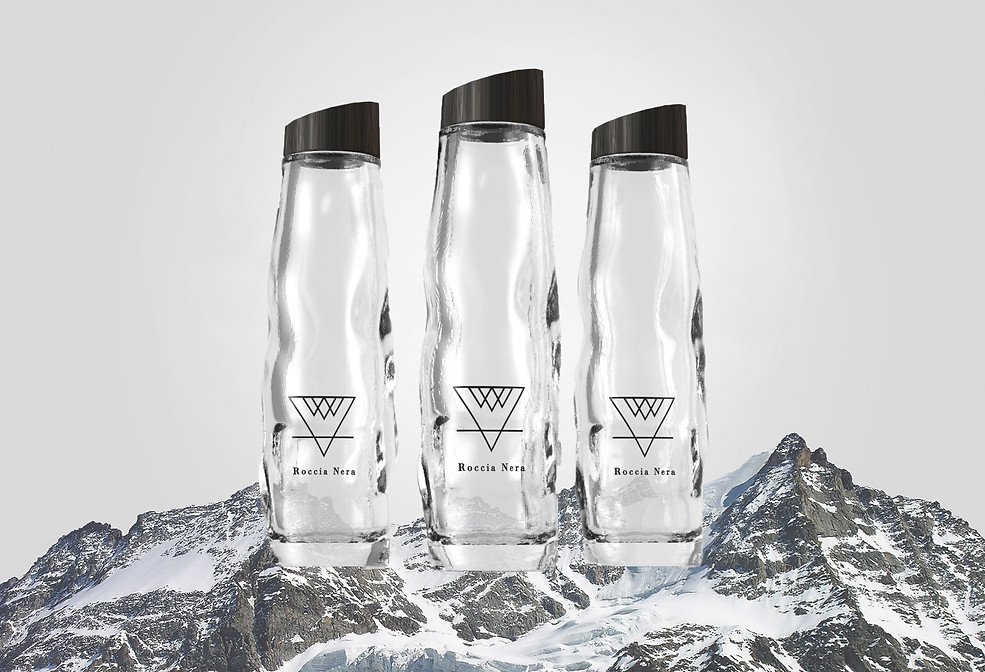
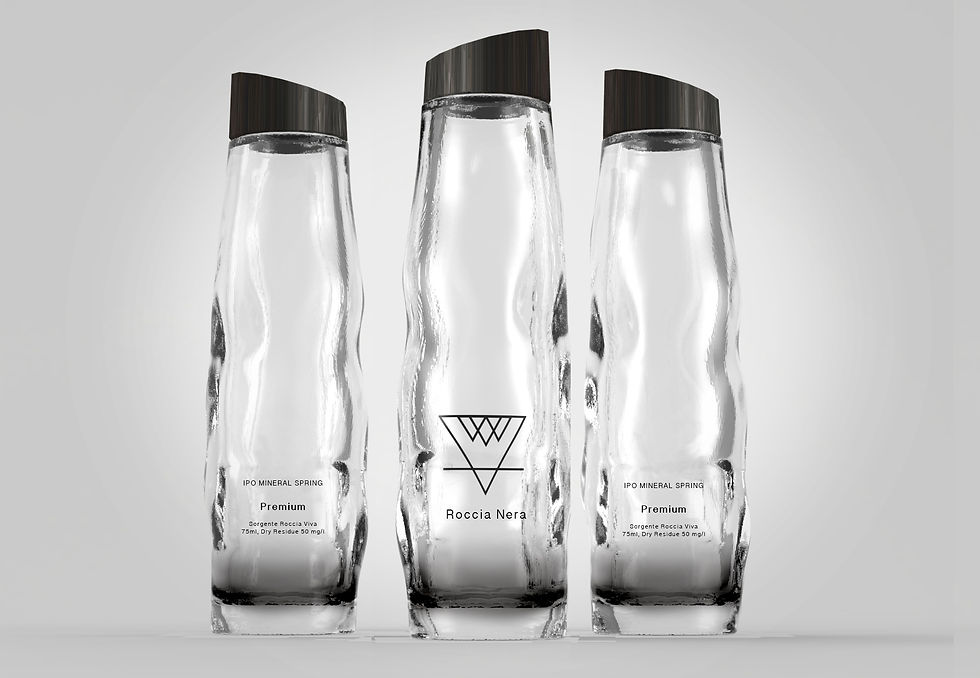
We focus on recycling, healthy and safe materials. The bottle is 75ml and eco-friendly. The cap is in recycle fir wood in antracite color. Fir is a typical tree of the Roccia Viva source flora.
The bottle shape reminds of a rock. The black bottom refers to our brand name. The material is borosilicate glass, it is a strong and light material, known for its quality of resistance to thermal shock.


Advertising Campaign
The concept of this campaign is based on two of our core values: nature and design.
PAYOFF
Designed by nature.
In the magazine we proposed mini samples, 15 ml, of Roccia Nera water, in transparent coated material, presented in the same way of perfume, to approach our target in an unconventional way.

